Mobile-First vs Desktop-First Design is one of the most important strategic decisions in modern product development, influencing everything from user experience to performance, scalability, and even search rankings.
As user behavior continues shifting toward mobile devices while business tools remain complex on desktop, choosing the right approach is no longer optional—it directly impacts how your product performs in the market.
Understanding how these two approaches differ will help you align design decisions with real user needs and business outcomes, rather than simply following trends.
What Is Mobile-First vs Desktop-First Design?
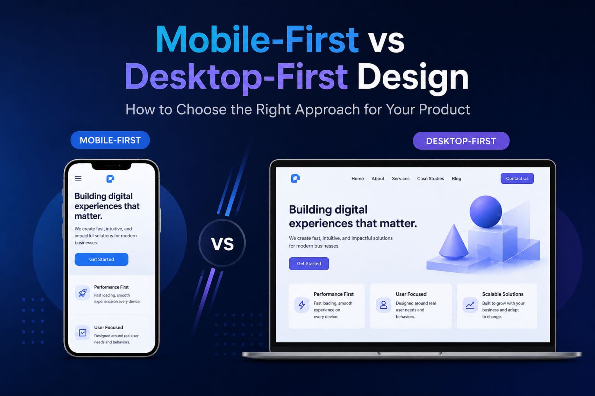
Every digital product starts with a fundamental choice that impacts usability and scalability. That choice is Mobile-First vs Desktop-First Design.
Mobile-First Design Explained
Mobile-first design begins with the smallest screen and builds upward. Instead of trying to fit everything in, it forces teams to decide what actually matters. That constraint is its biggest strength.
Because you’re designing within limited space, every element must serve a purpose. Navigation becomes simpler, content becomes clearer, and performance is naturally optimized early in the process. This is why mobile-first design is often associated with faster load times and higher conversion rates.
In practice, mobile-first design typically emphasizes:
- Clear content hierarchy from the start
- Lightweight assets and faster performance
- Touch-friendly interactions and simplified navigation
As the design scales to larger screens, additional features and enhancements are layered on top—without compromising the core experience.
Desktop-First Design Explained
Desktop-first design takes a more expansive starting point. With more screen real estate, designers can explore richer layouts, advanced interactions, and more detailed content structures without immediate limitations.
This makes it particularly useful for products that rely on complexity—where users need access to multiple features, data points, or workflows at the same time.
However, that flexibility comes with a trade-off. Without careful prioritization, it’s easy to introduce unnecessary elements that later become difficult to adapt for smaller screens.
Desktop-first design is commonly characterized by:
- Multi-layered navigation and feature-rich interfaces
- Higher information density and visual complexity
- Greater flexibility in layout and interaction design
When scaling down to mobile, teams must carefully decide what to simplify, remove, or restructure—making this approach more dependent on strong optimization practices.
Mobile-First vs Desktop-First Design: Key Differences, Use Cases, and Trade-Offs
To make the decision clearer, here’s how mobile-first design and desktop-first design compare across critical aspects that impact both user experience and business performance:
| Aspect | Mobile-First Design | Desktop-First Design |
|---|---|---|
| Starting Approach | Design for small screens first | Design for large screens first |
| UX Focus | Essential, simplified flows | Feature-rich, complex flows |
| Performance | Optimized from the start | Often requires optimization later |
| SEO Impact | Strong (mobile-first indexing) | Risk if mobile is neglected |
| Scalability | Expands upward more easily | Compressing downward is harder |
| Pros | Faster load times, cleaner UX, better conversion potential | Greater flexibility, supports complex functionality |
| Cons | Limited room for complex features initially | Can result in heavy, inefficient mobile experiences |
| Best For | E-commerce, landing pages, mobile-heavy audiences | SaaS dashboards, internal tools, data-heavy platforms |
| When It’s Most Relevant | When speed, accessibility, and reach are priorities | When workflows require depth, precision, and large interfaces |
This comparison highlights that mobile-first vs desktop-first design is not about choosing the “better” method—but the more appropriate one based on context.
How to Choose Between Mobile-First vs Desktop-First Design
Choosing between these approaches requires more than assumptions. It demands a clear understanding of your users, product, and business goals.
1. Analyze Your Users and Traffic
Start by evaluating where your users come from and how they interact with your product. If the majority of your traffic comes from mobile devices, adopting a mobile-first design approach ensures that your primary audience gets the best possible experience.
On the other hand, if your users rely heavily on desktop environments—such as in B2B platforms or internal systems—desktop-first design may better support their workflows.
2. Define Your Business Goals
Your design strategy should directly support your core objectives. If your goal is to maximize conversions, engagement, or accessibility, mobile-first design typically delivers better results due to its simplicity and performance.
However, if your focus is on productivity, efficiency, or complex task completion, desktop-first design allows for more advanced functionality and interaction.
3. Assess Product Complexity
Simple user journeys, such as browsing products or filling out forms, are ideal for mobile-first design. These experiences benefit from streamlined flows and minimal friction.
In contrast, complex systems—such as analytics dashboards or enterprise platforms—often require the flexibility of desktop-first design to handle multiple layers of interaction and data.
4. Consider Performance Requirements
Performance is a critical factor in both user experience and SEO. Mobile-first design naturally enforces performance optimization from the beginning, making it ideal for speed-sensitive environments.
Desktop-first design can still achieve strong performance, but it requires deliberate optimization to ensure that mobile users are not negatively impacted.
Mobile-First vs Desktop-First Design Is a Strategic Decision
Mobile-First vs Desktop-First Design is not about following trends—it’s about aligning your design strategy with your users, product complexity, and business objectives. The right choice can improve performance, enhance user experience, and ultimately drive better results for your business.
At NewGen Development, we don’t just design interfaces—we build scalable digital solutions tailored to your specific needs. From custom software development and UI/UX design to business automation and digital transformation, our approach ensures that your product is optimized for both performance and growth.
If your platform feels slow, difficult to use, or fails to convert users effectively, the problem may not be your technology—it may be your design strategy.
Let’s fix that.
Partner with NewGen Development to build digital products that are not only functional, but strategically designed to perform.